
On this website, you will find tutorials for installing & managing software, lists of the best linux resources, and in depth guides to linux.
Join us on Slack
On this website, you will find tutorials for installing & managing software, lists of the best linux resources, and in depth guides to linux.
Join us on SlackRobert Washbourne - 3 years ago - themes
Linux generally has good, clean looks but the icons are sometimes... a bit lacking. However, with a few small changes, your desktop can look amazing with these icon packs. Icon packs are generally a large amount of images which control how your application, file, and system tray icons look.
Most of the themes below will have installations based in the terminal (Ubuntu / Fedora / Arch), but for some of them, you need to download the actual files. In those cases, you can simply download the theme archive (.zip, .tar.gz), and extract to the folder .icons for the icon theme to be installed on your user (note: on Fedora, the default is .local/share/icons). To install for all users, move the icon theme folder to /usr/share/icons/ instead.
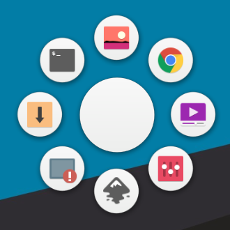
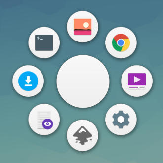
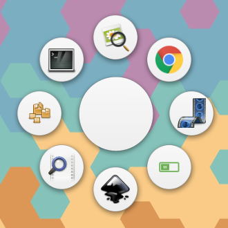
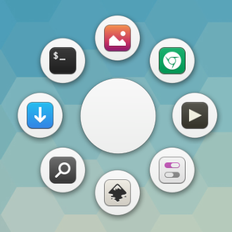
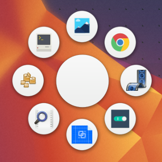
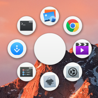
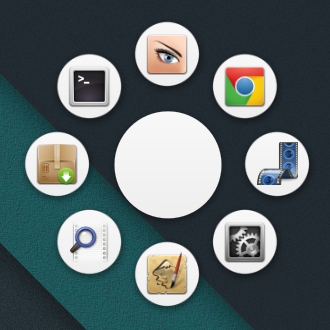
The circular app launcher you see in screenshots is Gnome Pie.
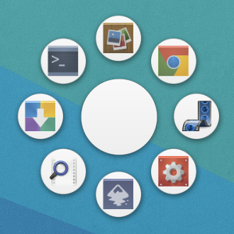
Shown with the Arc dark gtk theme
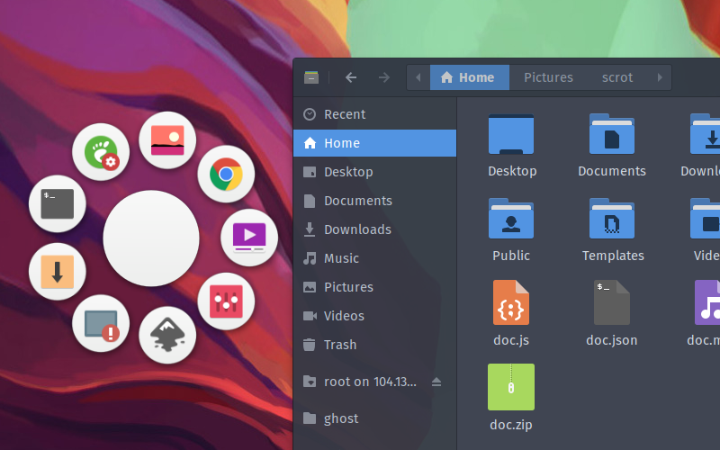
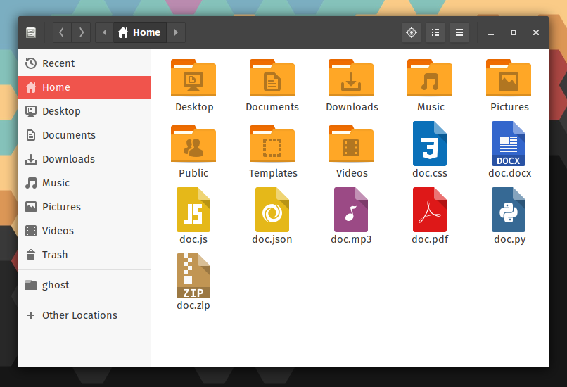
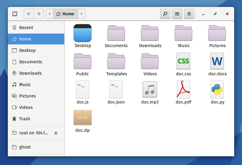
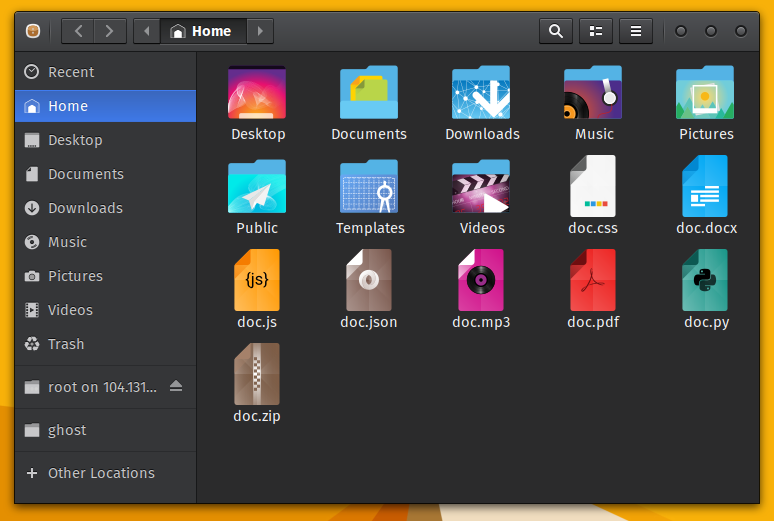
Common applications
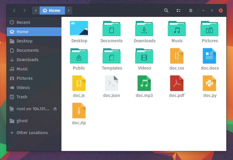
Papirus is a new-ish icon theme from the Papirus Development Team. It is based on the Paper icon theme, but I like the feel of Papirus much better. The Papirus Development Team has also made themes for LibreOffice, SMPlayer, and Filezilla, integrating them with the Arc gtk theme.
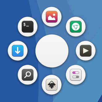
Shown with the Paper gtk theme
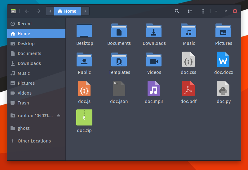
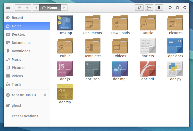
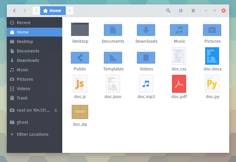
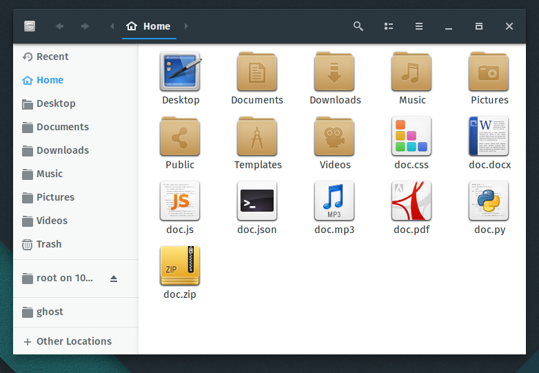
Common applications
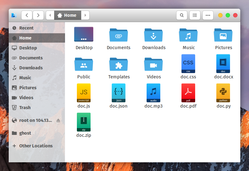
Paper is an icon theme by snwh. Paper is one of the most popular aesthetic kits, and includes a gtk theme with brighter colors, but less icons than other themes (Paper lacks icons for coding files which Papirus and Numix have).
Shown with the Numix gtk theme
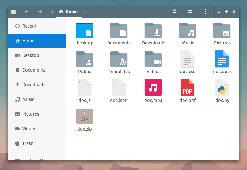
Common applications - Numix has less icons than alternatives; result is this ugly fallback
Numix is an icon theme by the Numix Project, a big player in Linux theming. Their themes are the default on several distros, and are popular with users. Numix stands up to these expectations fairly well, but (in my opinion) lacks the subtle vibe you see with Paper and Papirus.
Shown with the Vertex light gtk theme
Common applications
Evolvere is a square icon theme that is relatively unheard of. Surprisingly, I found the icons to be very complete and to look pretty good! Inside what the author calls "Evolvere Suite", you will find variants of the theme with different folder styles and slightly different icons. The one I show above is "Evolvere Sunken".
Shown with the Adwaita gtk theme
Common applications
Moka is another great icon theme by snwh. It is used as a baseline for several other themes, such as the Arc icon theme. It's shown here with the Adwaita theme, the default for Gnome users. Moka has a slight circular border- I like it.
Shown with the Arc light gtk theme
Common applications- Arc falls back to Moka
The Arc icon theme, created by the developer of the insanely popular Arc gtk theme, is a great material icon theme; I just wish they would make some more icons! A lot of application icons fall back to other themes.
Shown with the Arc darker gtk theme
Common applications
Flattr is another material inspired icon theme; it does a fairly good job at it. Several other icon themes, such as Super Flat Remix, are inspired by it.
Shown with the Gnome OSX ii gtk theme
Common applications
La Capitaine is an icon theme that "takes inspiration from the latest iterations of macOS and Google's Material Design". I'm showing it here with the Gnome OSX ii gtk theme, and the duo makes a good Mac-esque look.
La Capitaine is based on a set called "Antü" by Fabián Alexis, which is used in KaOS (KDE distro).
Shown with the Vertex dark gtk theme

Common applications
Xenlism Wildfire is an icon theme that tries something a bit different; it includes more "images within images" and looks a bit more fun. Xenlism icons have a bit of a circular look, as shown in the wheel screenshot.
Shown with the Adapta-Nokto gtk theme
Common applications
Faenza is another "older looking" icon theme, with more of a realism texture than flat themes like Paper, Papirus, and Xenlism. Applications are mostly shown as squares, and the icons have slight drop shadows.
To see other topics about Linux themes, follow this link.
Do you like these icon themes? Do you hate them? Drop a line in the comments below with your favorite icon theme, and I'll be sure to take a look.
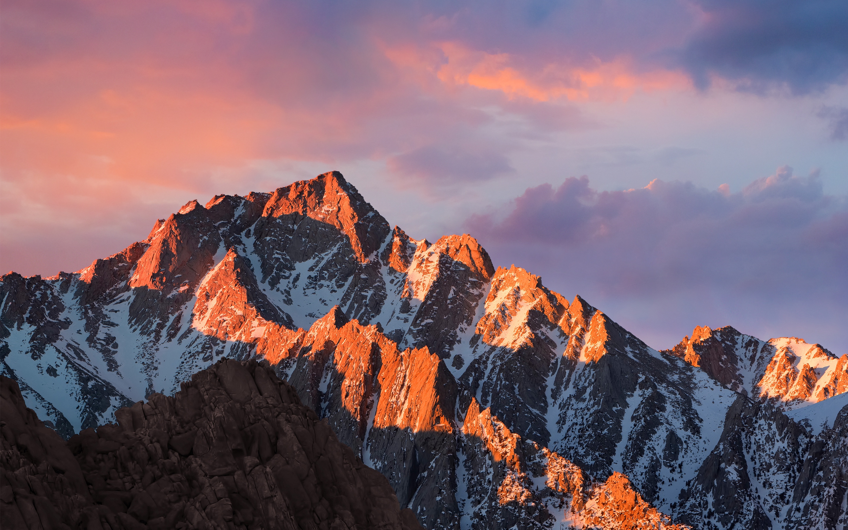
If you want the wallpapers that I used, here is the imgur gallery I made. Here is the wall for La Capitaine, and here is the wall for Faenza.

We don't spam, and we only send emails once or twice a week month.